After users requested a new icon for over 5 years, I persuaded main developer ByteHamster that the release of version 2.0.0 is a good time to rework the icon. We therefore developed and published a design brief with requirements for the new icon. You can find the design brief below.
Design brief AntennaPod logo update
About AntennaPod
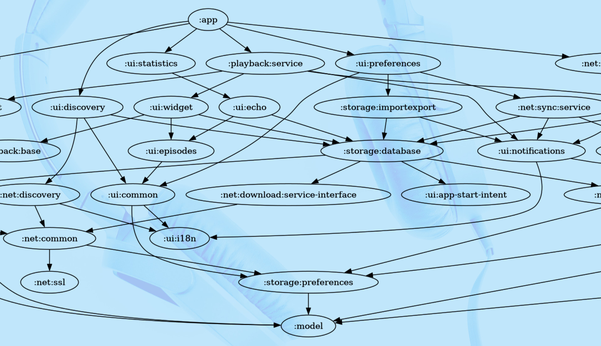
AntennaPod is a podcast manager and player for Android. Contrary to many of its competitors, it is open source (MIT License), developed and translated by volunteers, gratis and ad-free. It allows users to discover new podcasts, download, stream and manage episodes, and launch playback with personal settings and on a range of different devices. It is translated in 17 languages with more than 90% completion (and even 25 languages with over 60% completion). With over half a million downloads via Google Play, AntennaPod is installed on more than 150,000 actively used devices.
Assignment & scope
The app’s current main developer is currently working on AntennaPod version 2, an important update with lots of bug fixes and UI improvements. To honour this major step, we are looking for a new logo and app icon. The goal of the new design is to help give AntennaPod a modern and professional look, which is in line with the updated UI and speaks to the wider audience (beyond open source and privacy advocates).
- The logo will be used on the website and in the app
- The icon will be used for the installed app, in app stores and for social media accounts
- Both the full logo and the icon may also be used in potential future communication materials (including print)
- Secondary assignment is the delivery of simple colour palette is also expected, as to ensure future consistency
- Ideas are welcome, but not necessesarily in scope of this assignment, for:
- new promotional visuals (hopefully produced following new logo, to announce v2 of the app)
- design ideas for a new, modern website (hopefully done in the not too distant future)
Design requirements
The new work must:
- contain the name: “AntennaPod” (only for logo)
- use a libre font (so any contributor can create new comms materials)
- still be recognisable as AntennaPod by existing users, and therefore, must
- have blue as primary or secondary colour (any shade, same as or different from current)
- somehow use the concept of an antenna in the icon
- come positive & negative version (for on light & dark background)
- adhere to Google Play icon design specifications (only for icon)
- also come in super small white-on-transparent version legible in super small size (icon only, for Android’s status bar)
- be deliverd in vector format (preferably svg, as not all an open AI files)
The current logo icon
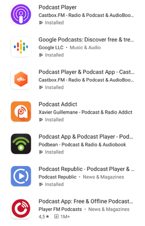
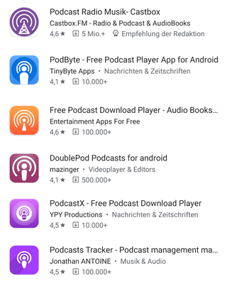
The competition
As you can see below, there’s both some variety and a bunch of same-ish icons. Our aim is to get something unique :-)
License
Designs are provided with an unlimited and unrevokable license to the AntennaPod project, allowing its use and future adaptations/iterations. The licensed product (the designs) will be used as the project’s (unregistered) trade mark(s) and used and embedded as such in the project’s products (website, app, etc). (cf Trademarks in Open Source)
Feedback, iteration, selection
Keunes (comms) and ByteHamster (lead developer) are responsible for guiding the process. Keunes will be the contact person for the designer(s).
As a community project, contributing users and others interested will have an important role. To that end, the ‘active community’ will be involved (in a restricted manner, as described below). With ‘active community’, we refer to all beta users of the app (3.4k), those following a GitHub issue on the topic (13+) and those following the project on Twitter (867).
- First round. After the call for proposals, one to three are selected by Keunes & ByteHamster. Feedback is provided to selected proposals. New iterations based on the feedback (if any) are expected.
- Second round. The new iterations (and those that stayed the same) are put up for a vote by the active community. Participants will rate each of the proposals, and optionally provide open comments on their favourite proposal. To make sure the winner is validated as better than the current icon, the current icon will also be included. For the most popular proposal, relevant comments will be filtered and bundled by Keunes and provided to the designer. Based on the feedback (if any), an iteration is welcomed but not required.
The community will need to sign in with their Google account to be able to vote, in order to avoid malicious votes. Users without Google account are offered an alternative.
Timeline
We’d love to hear from you by Wednesday 24 June if you’re interested to help out (or if you have any questions or comments). The deadline for the proposals will be Saturday 27 June. ByteHamster and Keunes will then select proposals & provide feedback by the following Wednesday. After, we’ll have two weeks for iterations (if any) and launching the poll in the Beta version of the app on Thursday 16 July. We then hope to be able to implement our new icon by the end of the month :)
Financial thank-you
As a project without official structure or own funds, proper compensation won’t be possible. However, as to support open source designers, Keunes would like to offer € 25 to those selected in the first round, plus € 50 to the selected logo. Designers may also decline the offer, in which case their financial thank-you will be donated to the Open Source Design initiative.
Of course you’d be acknowledged by name on the site and in the app’s ‘About’ section.
Interested? Contact us!
Thank you for considering support to this open source app! Reply to the ad on opensourcedesign.net or get in touch at [email address removed].